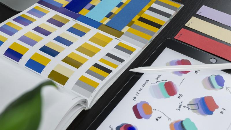
Every digital product replays the same scene: a designer picks a shade in the design tool, a developer writes a close-enough value in code, and six months later the product has eleven different "blues" and nobody knows which one is right. Design tokens are the structural fix for that chaos — and the cheapest way we know to stay consistent as a product and a team grow. In this article we explain how we treat tokens at Grid: as a binding contract between design and engineering, not just a color file.
What are design tokens?
A token is a named design value: instead of writing #237F8C in twenty places, you define color-brand-primary once and reference it everywhere. The same applies to spacing, font sizes, radii, shadows, and motion durations. The value lives in one place; the name carries the meaning.
The real power isn't the naming — it's the consequence: when the brand's primary color changes, it changes in one source and propagates automatically to the web, the app, and the marketing emails, instead of weeks of manual hunting.
A token is a contract — and a contract has two parties
The common mistake is treating tokens as a config file that belongs to developers. Successful tokens are a contract between design and engineering: the designer commits that every visual decision goes through a named token, and the developer commits that not a single raw value enters the codebase.
Any visual value without an agreed name is visual technical debt — you'll pay for it at the first redesign.
With that contract, the "is this the right gray?" debate happens in exactly one place, and code review turns from comparing hex numbers into reading clear intent.
Three layers keep the chaos out
Flat token lists collapse at the first dark mode or sub-brand. The structure we rely on has three layers:
- Core tokens — the raw palette:
teal-600,space-4,font-size-16. Never used directly in interfaces. - Semantic tokens — functional meaning:
color-text-primary,surface-raised,border-focus. They point at the core layer. - Component tokens — only where needed:
button-bgpointing at a semantic token.
With this structure, dark mode is not a new CSS file — it's remapping the semantic layer to different core values. A new sub-brand is a new core palette under the same semantic names.
One source of truth — everything else is generated
The contract breaks the moment it has two copies. We keep tokens in a single source (usually JSON files in the repository, or a tool like Tokens Studio wired to it) and generate every format from it automatically: CSS variables for the web, design-tool values, native platform constants. Tools like Style Dictionary make that generation an ordinary build step.
The golden rule: edits happen in the source only. A manual tweak in any generated format is a breach of contract — and it will be erased by the next generation run anyway.
Change governance: tokens have versions
Changing a token's value touches every screen in the product, so it deserves versioning discipline: changing only a value is a patch; renaming or removing a token is a breaking change that needs a transition window and a clear migration path. Token changes get a shared review — designer and developer together — because a contract is never amended by one side.
A checklist for starting with tokens
- Have you inventoried the duplicated visual values in your current product (colors first)?
- Are tokens split into core and semantic layers — with interfaces consuming only the semantic ones?
- Is there a single source from which every format is generated automatically at build time?
- Does an automated CI check block new raw values from entering the code?
- Do token changes go through a joint design–engineering review?
The bottom line
Design tokens aren't a luxury for big design teams; they're the cheapest insurance against the consistency rot that hits every growing product. A clear contract, three layers, one source of truth, and lightweight governance — that's all it takes to keep your product's identity coherent across every platform, every team, and every redesign to come.
At Grid we build design systems and token architectures for Arabic and English products alike — including the challenges of RTL and LTR. If your product suffers from accumulated visual chaos, get in touch and we'll help you build the system that stops it at the root.