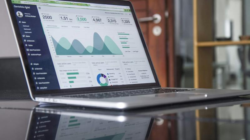
Most dashboards die a quiet death: built with enthusiasm, shown once at the launch meeting, and unopened two weeks later. The problem is rarely the data — it's design that shows everything and says nothing. A successful dashboard isn't a gallery of charts; it's a daily decision tool. In this article we distill the principles we use at Grid to design dashboards people open every morning because they actually answer their questions.
Start from the decision, not the data
The wrong question when building a dashboard: "what data do we have?". The right one: "what decisions does this dashboard's user make every week?". Every element must answer a specific question that leads to action — "do we need to intervene today?", "where are customers leaking?". A chart that changes no decision is noise, however beautiful.
Every chart on the dashboard answers a question — if you can't write the question down, delete the chart.
Data-ink: every pixel earns its place
Edward Tufte's famous principle: give as much "ink" as possible to the data itself, and as little as possible to decoration. In practice that means removing shaded backgrounds, heavy borders, gradients, drop shadows, dense gridlines, and 3D effects — they all compete with the data for the eye's attention and add no information. A clean dashboard isn't an aesthetic preference; it's reading speed.
One accent color is enough
A dashboard using ten colors distinguishes nothing — when everything shouts, nothing is heard. The system that works: quiet grays for the base, one accent color for what matters most — the line that matters now, the segment that needs attention — and red reserved exclusively for genuine warnings. With that discipline, color guides the reader's eye to what deserves it within a second.
Hierarchy guides the eye
Readers scan dashboards; they don't read them line by line. Design for that behavior: the critical numbers at the top, large and unmissable; supporting detail beneath; deep exploration at the last level or behind a click. And the one-screen rule: what needs long scrolling won't be seen — if sections multiply, split them into dashboards for different audiences instead of one endless screen.
Choose the chart that matches the question
- Trend over time — a line. Nothing beats it.
- Comparison across categories — bars, sorted largest to smallest.
- One critical number — a big number with its change indicator versus the previous period, not a speedometer gauge.
- Pie charts — rarely: two or three slices at most, otherwise bars are clearer.
And watch for bar-chart axes that don't start at zero — they inflate differences and deceive the reader, and a dashboard's credibility is its most valuable asset.
A number without context is not information
"Revenue: 48,000" — is that good? Nobody knows without a comparison. Every number on the dashboard needs a reference: the previous period, the target, or the market average. Add the target line to the chart, the change percentage next to the number, and color the deviation — then the number turns from a statistic into a verdict: we're fine, or we need to act.
For Arabic audiences: the dashboard reads from the right
Bilingual dashboards are a challenge we handle daily: in the Arabic interface the entire layout mirrors (RTL), so the visual hierarchy starts at the top right — while time axes inside charts still run left-to-right as readers expect for numbers. Long numbers and dates need correct locale formatting. Test both versions — a dashboard that reads naturally in Arabic doesn't come for free from a foreign charting library.
A pre-launch dashboard checklist
- Does every chart answer a clear decision question you can write in one sentence?
- Have you removed every decoration that carries no information — backgrounds, shadows, 3D?
- Do you use one accent color, with red only for warnings?
- Is the most important content at the top, everything visible without long scrolling?
- Is every number paired with a comparison that gives it meaning — a target or a previous period?
The bottom line
A good dashboard isn't the one with the most charts but the one that answers fastest: the decision-maker opens it and knows within seconds whether things are fine and where to look. Start from the questions, be frugal with ink and color, order by hierarchy, and give every number its context — and you'll get that rare thing: a dashboard people open every day by choice.
At Grid we design bilingual dashboards and interactive reports for companies and organizations — from data modeling to an interface that actually gets read. If your dashboards get built but never opened, get in touch.